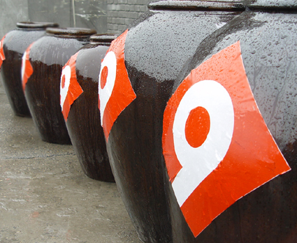
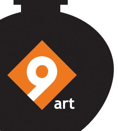
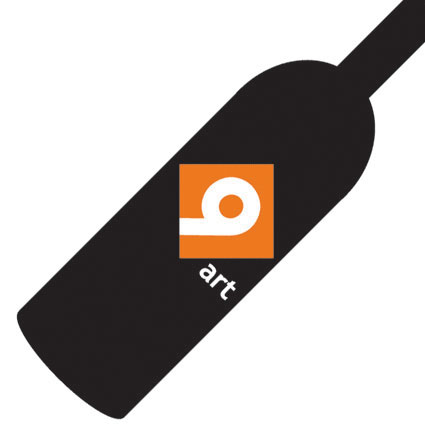
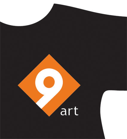
新设计:北京酒厂国际艺术园标志logo for 9ART
[ 2006-09-01 08:36:35 | Author: xiaoyong ]
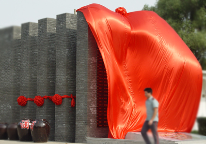
北京酒厂国际艺术园标志:
取9为酒的谐音,意蕴长久,
菱形为酒贴外形,继往开来,
9为地理区位特点,海纳百川,
9形态表现艺术核心凝聚与发散,
橙色体现时尚与现代气息。
logo for 9art zone,a artists' and designers' park,one of Beijing's leading creative industrial park.
the form inspired from the traditional alcohol bottle label,enclude number 9 in the centre which phonetically simulating alcohol in Chinese.


2006.9出版
视觉体现价值-肖勇
今天的读者,阅读习惯在发生改变,媒介的传播和诉求方式也在转变,
对于版式,风格的设计不再是图文搭配的问题,而是信息传载方式与审美品位的立体再现。
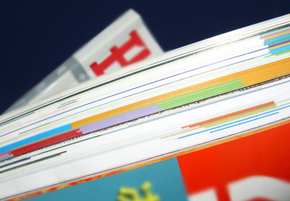
时尚刊物与杂志面临空前的挑战与竞争,这已把价格因素抛在后面,因为读者买感觉并不仅仅在意价钱。
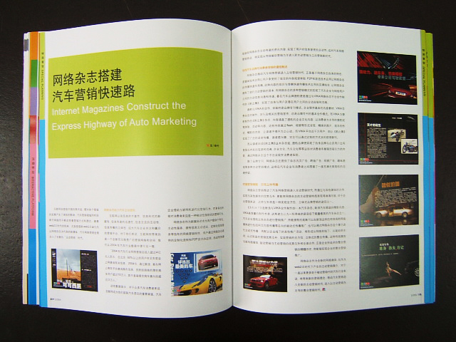
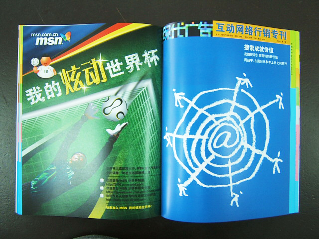
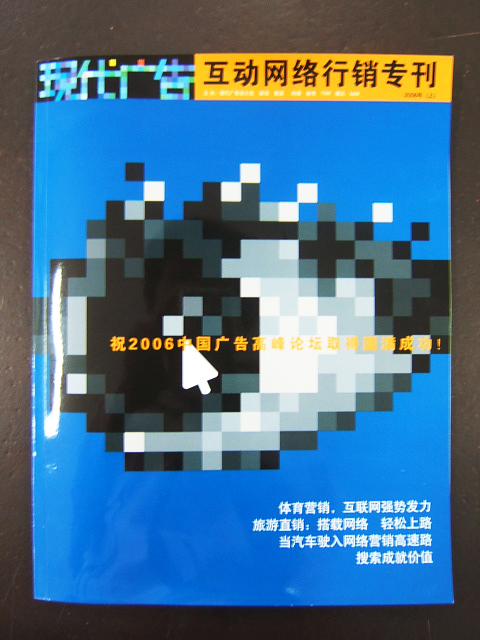
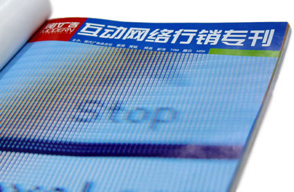
2006.8《现代广告》出版,网络行销专刊设计
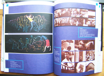
2006.7《现代广告》出版,网络行销专刊设计
新改版了内页和网络周刊,增加了插图的表现。
2006.5/6整合设计《北京青年周刊》《现代广告》
Redesign for Beijing Youth weekly and Modern Ad.
肖勇应聘担任《现代广告》杂志设计总监。
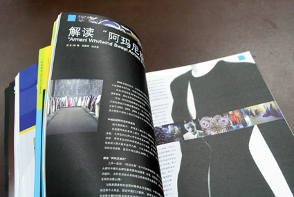
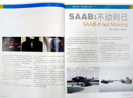
2006.6期,版式设计根据内容进行分析,在结构和细节上做出调整,体现广告与传媒的特征,根据文字量的特点,在布局与标题上重点规范。
应对大众媒介印刷媒体提升质量的竞争。
肖勇工作室为《北京青年周刊》《现代广告》整合设计,
涉及整体形象,版式,结构与风格的调整。
《现代广告》是广告行业的龙头杂志,在业界卓有影响。
之前,还为天津《每日新报》《生活》等进行过整合设计,获得良好的反映。
目前,还有数本书刊与肖勇工作室进行合作。
Redesign for Beijing Youth Weekly, a weekly magazine for fashion and public, circulation at 100 000 copies a week.The design including image, style, structure of graphic solution, also detailed design for cover and typograpgy.
Meanwhile, Modern Ad., Chinese leading ad. magzine also requested to be redesigned by Xiaoyong.
《现代广告》2006.5期

[Last Modified By xiaoyong, at 2006-12-06 16:43:32]
 Comments Feed: http://www.xiaoyong.com/blog/feed.asp?q=comment&id=99
You can't post comment on this article.


广告吹得很响
设计做得不怎样